he Role of Color Theory in Abstract Artwork
Why Colors in Abstract Art Make You Feel Something
When you stand in front of a piece of abstract art, you might not see a clear subject—but you feel something instantly. Calm. Energy. Joy. Melancholy.
That’s the power of color theory.
At The Art Warehouse, our handmade abstract artworks are crafted with thoughtful color choices that go beyond beauty—they’re built to evoke emotion and create harmony in your space.
“In abstract art, color does the talking—every hue tells a story.”
What Is Color Theory?
Color theory is the study of how colors interact, contrast, and complement each other. It’s how artists create mood, movement, and depth in a painting—even when there’s no recognizable image.
Key Concepts of Color Theory:
- The Color Wheel – Primary, secondary, and tertiary colors.
- Warm vs Cool Colors – Warm tones energize, cool tones calm.
- Complementary Colors – Opposites attract (like blue + orange).
- Analogous Colors – Neighbors on the wheel for a cohesive look.
- Value & Saturation – Light vs dark, muted vs vivid.
🎨 Want to dive deeper into how we use these in real paintings? Explore Our Abstract Collection
How Artists Use Color in Abstract Work
In abstract art, color becomes the main character. Since there’s no figure or landscape to rely on, the palette must do the emotional lifting.
Here’s how we use color at The Art Warehouse:
- Bold Contrasts – To create energy and movement.
- Soft Gradients – To evoke calm, serenity, or nostalgia.
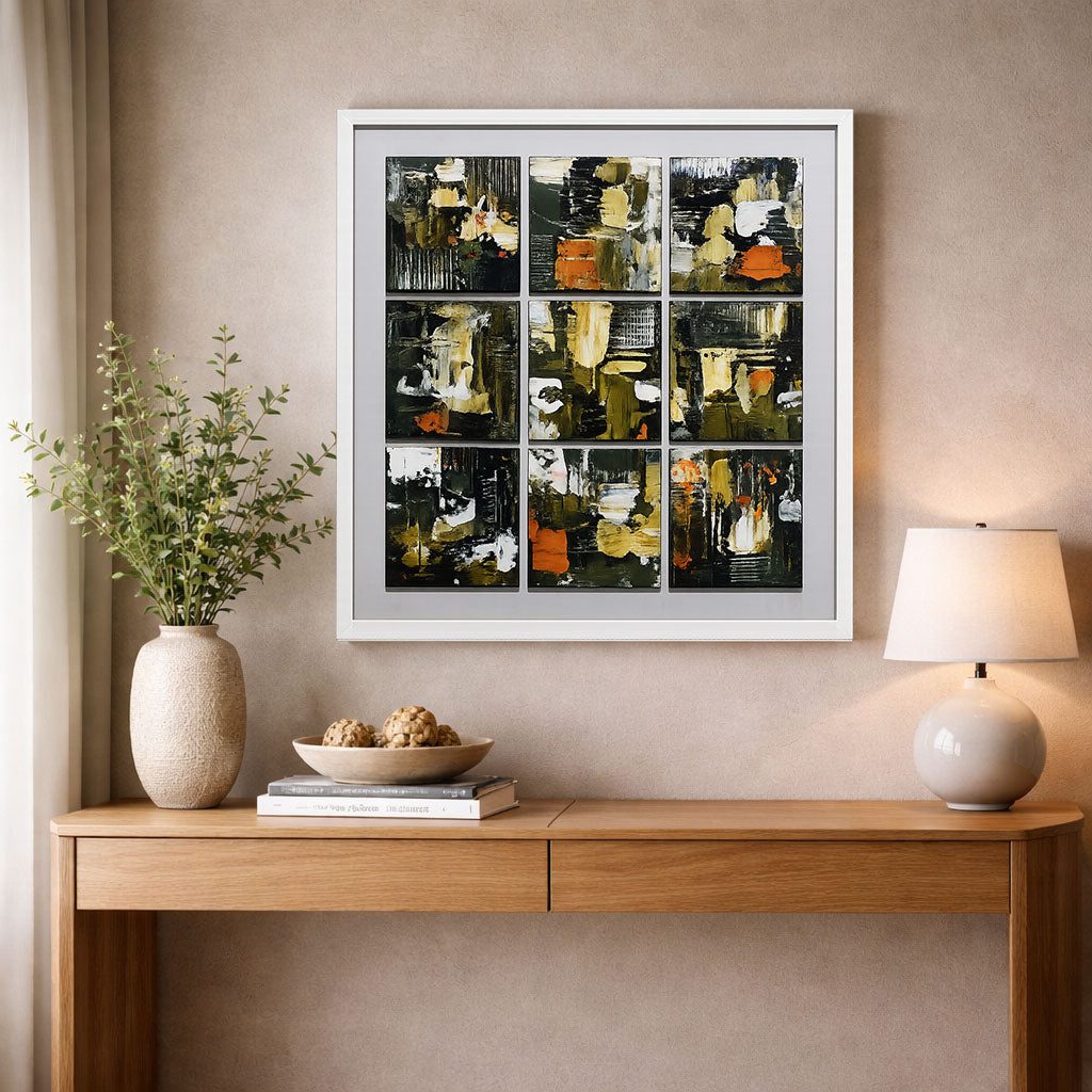
- Layered Hues – For depth and complexity, using brush and palette knife.
- Seasonal Palettes – Inspired by nature and interior trends.
🖼️ Each piece is handmade and never exactly duplicated. Learn more about our creative process
Choosing Colors That Match Your Space
Color theory isn’t just for artists—it can help you choose the right art for your home.
Tips for Picking the Right Abstract Artwork:
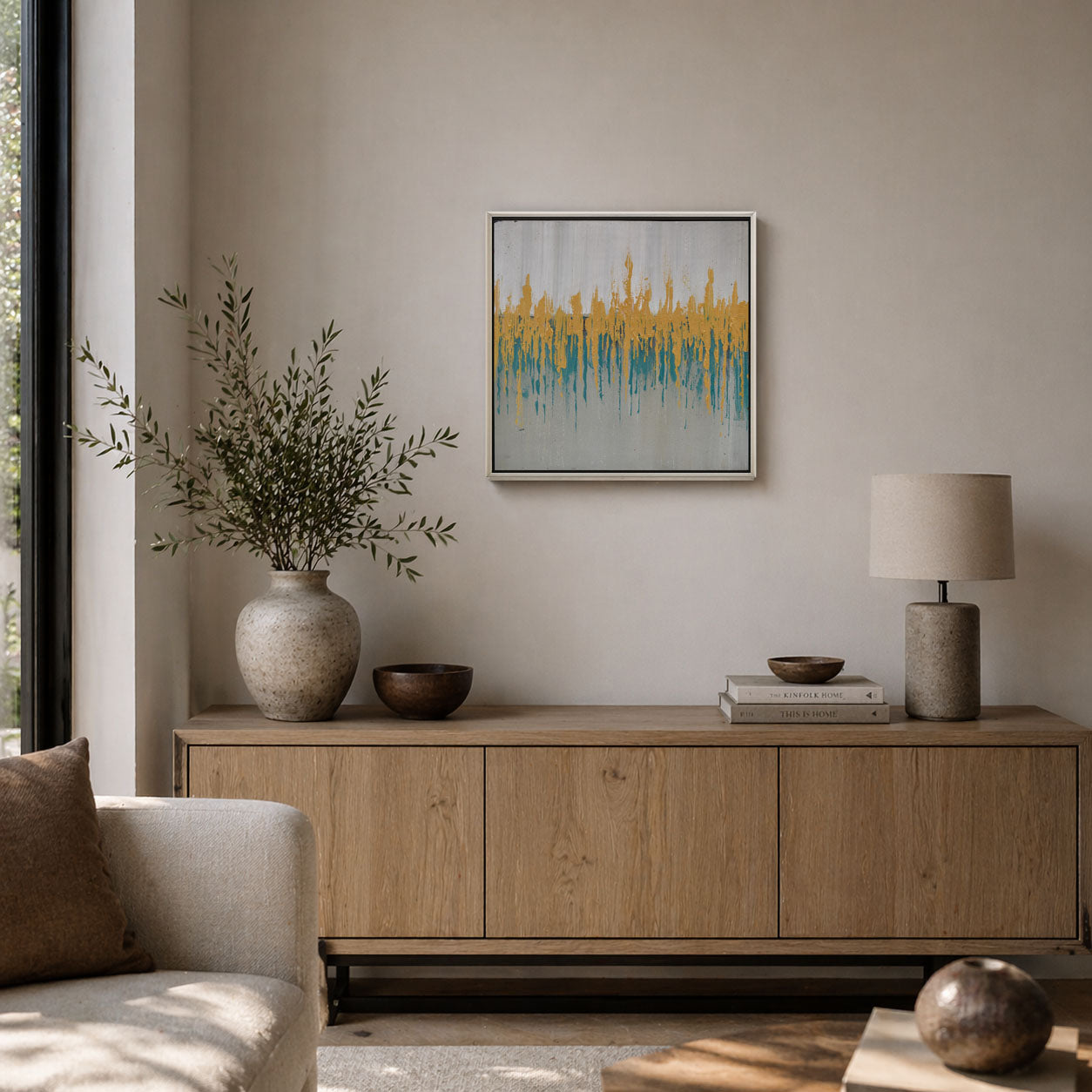
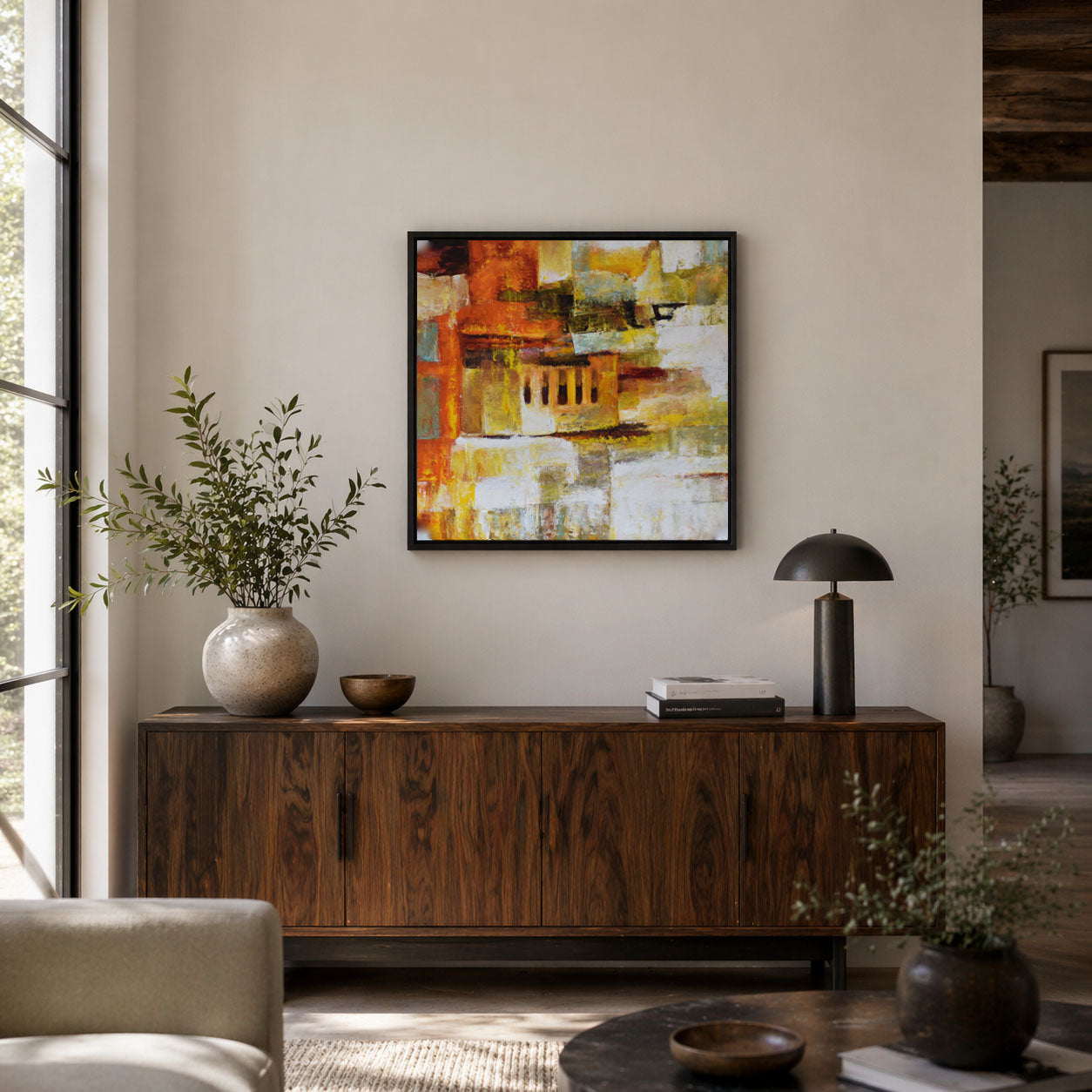
- Neutral Rooms – Go bold! Add a pop of vibrant color for contrast.
- Earthy Interiors – Choose warm, grounded palettes like ochre, rust, and sage.
- Minimalist Homes – Monochrome or soft, tonal abstract pieces add sophistication.
💡 Need styling inspiration? Check out our Gallery of Styled Spaces
Image Suggestions (With SEO Alt Text)
-
Close-up of abstract painting with warm and cool tones blending
Alt: Handmade abstract artwork using warm and cool color theory -
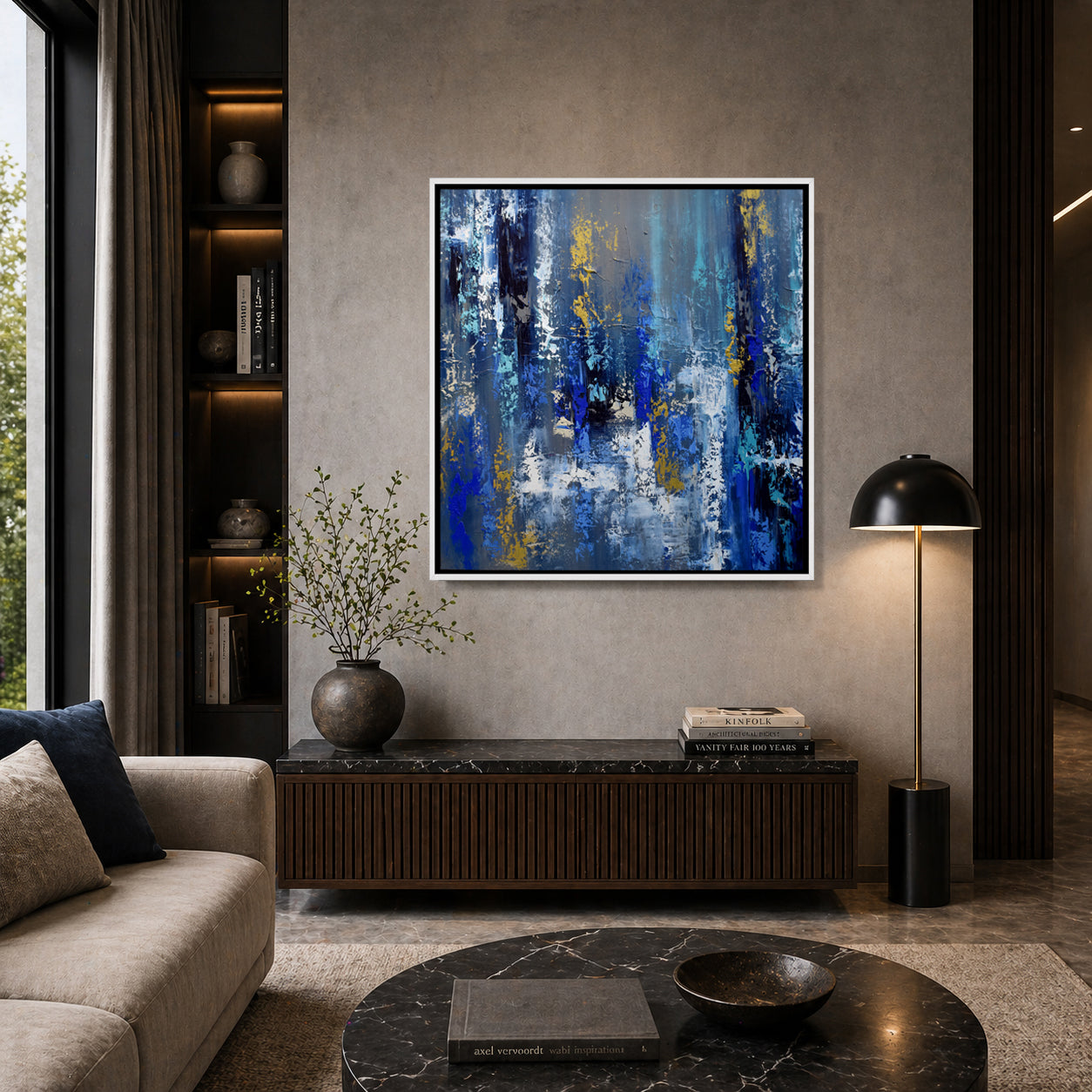
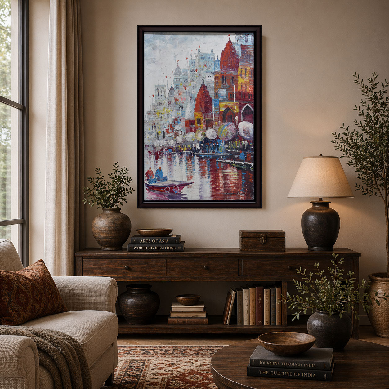
Modern living room with large colorful abstract canvas
Alt: Abstract wall art with vibrant palette hanging above modern sofa -
Artist mixing paint on palette using color wheel
Alt: Abstract artist using color theory to blend custom colors on canvas
Why Color Theory Matters in Handmade Art
When our artists create, they aren’t just putting paint on canvas. They’re making intentional color choices based on emotion, energy, and harmony. This is what separates handmade from mass-produced. Each piece carries a purpose—and you can feel it in the colors.
🧡 Looking for a statement piece that aligns with your energy? Shop Our Abstract Art Collection
Final Thoughts: Color as Emotion
Whether you’re drawn to moody blues, fiery reds, or calming neutrals, color theory helps you understand why. It’s not random—it’s rooted in psychology, design, and emotion.
At The Art Warehouse, our handmade abstract paintings are crafted with care and color insight, so you can find a piece that speaks to both your space and your soul.
👉 Ready to bring your walls to life through color? Explore Our Abstract Artwork Today